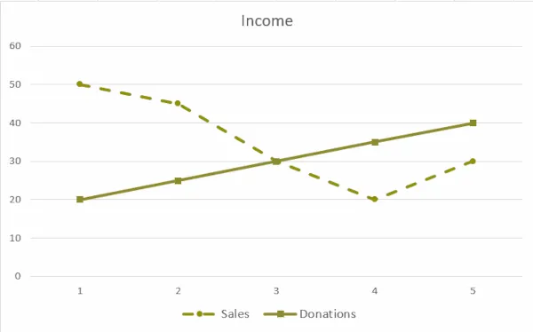
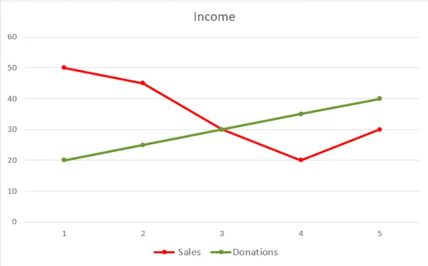
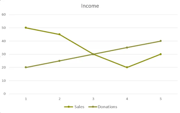
Colors get lonely.
- Summary: When color conveys information, you should add at least one other visual indicator.
- Who it helps: People who are color blind or have low vision.
- Additional benefits: Your audience can better understand your content when printed in grayscale or viewed on a mobile device.
Color can call attention to your content, help sighted individuals quickly perceive and process information, create a mood, and brand a product. However, not everyone in your audience may be able to distinguish between colors:
- Color-blind individuals are not always able to distinguish between colors and generally do not benefit when color is used to convey information.
- Individuals who have low or limited vision or who use a screen reader may also not be able to quickly distinguish between colors.
What can I do?
To fix this, add at least one other indicator when the color has meaning to ensure that everyone can understand the information being communicated.
Some examples of additional visual indicators are:
- Adding text or text labels
- Changing contrast, size or shape
- Including icons or symbols
- Modifying the texture or pattern
- Altering the presence, absence or location of information