Contrast is not just about differences.
- Summary: When images have text in social media, place the text on a contrasting background and repeat the text outside the image.
- Who it helps: People with low vision and who are blind.
- Additional benefits: Helps your audience read your content outside and in high light areas.
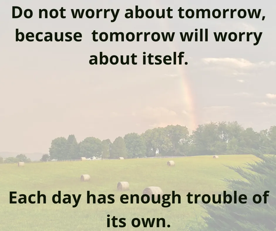
We often add text to social media images, either to advertise, inspire or to meme. To ensure that as many people as possible can read the text in your content, you need to be thoughtful about how you place it. We’ll be using an image of a rainbow over a hay field as an example.

What can I do?
There are a few strategies you can use to create readable graphics with text.
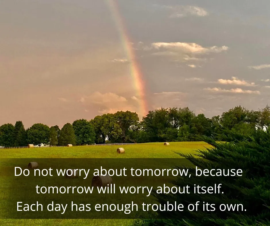
Add a shadow or colored box behind the text.
- This shadow can be dark or light as long as it contrasts with the color you use for the text.
- If you make the shadow or colored box semi-transparent, it can provide enough contrast for the text while still allowing some of the image to come through.
- In general, place the text (and the contrasting shadow or box) over the least important part of the image.
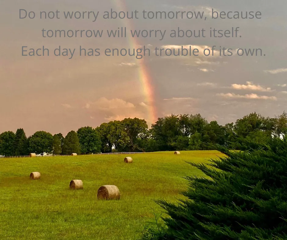
Darken or lighten the entire image and use larger and heavier text to make it more readable.
Lastly, for people who cannot see the image at all, make sure you add alternative text to the image that includes the text written on the photo. If the social media platform doesn’t allow this, repeat the text in the post itself.